Levi’s Logo Rebrand
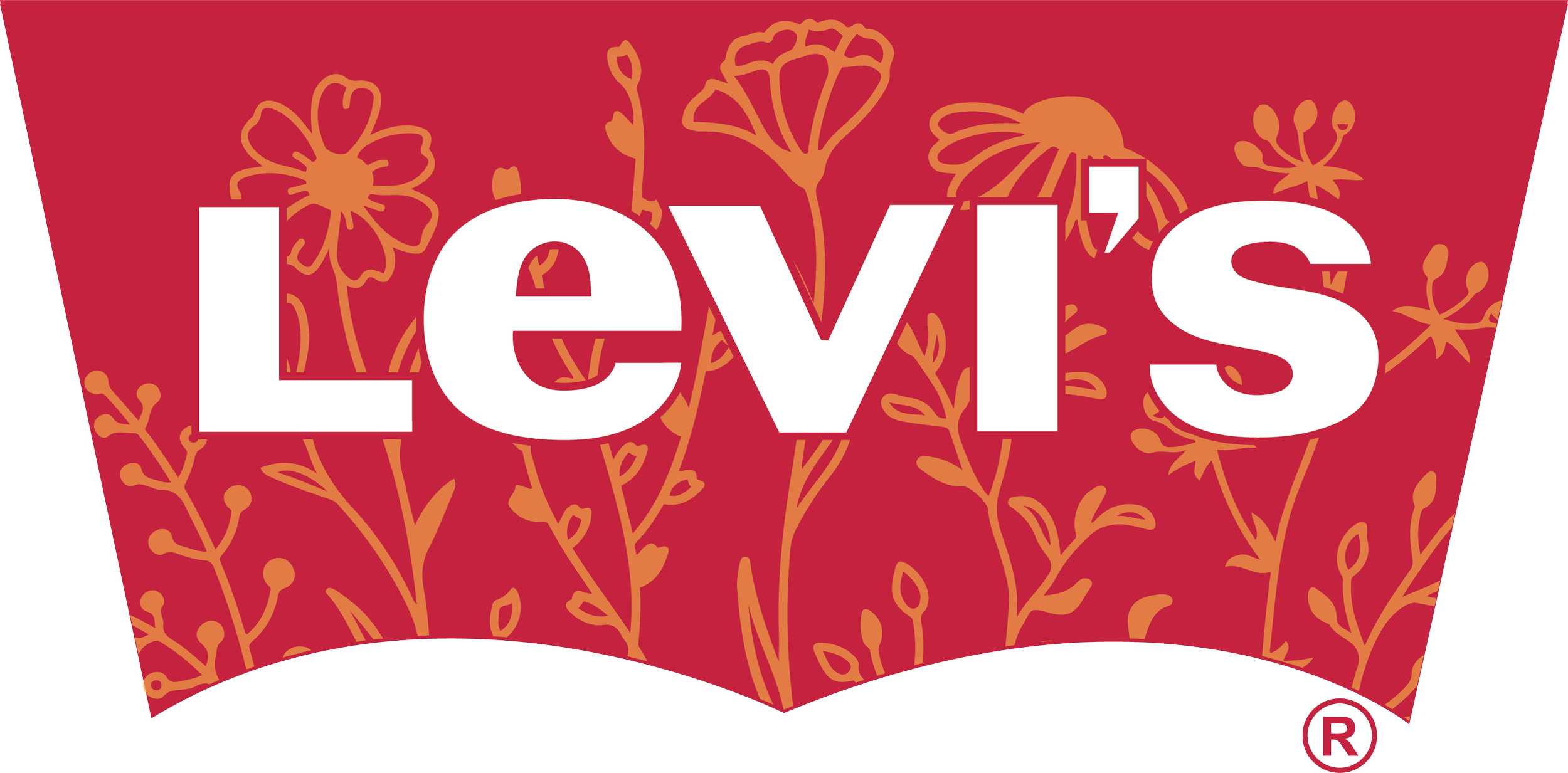
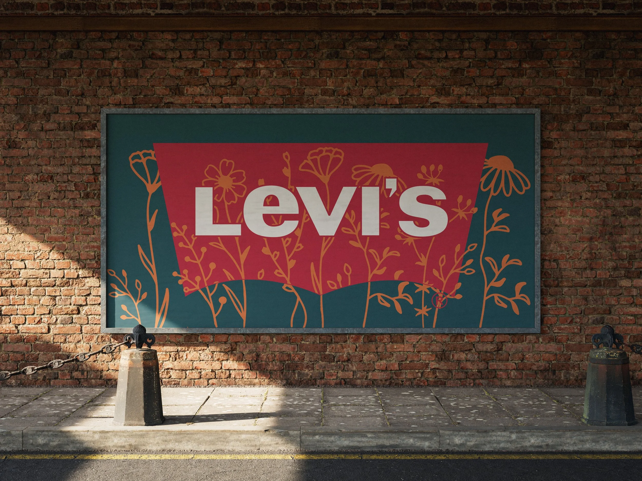
In 1934, Levi’s released their first pair of jeans specifically tailored for women. To honor this, this logo features a field of wildflowers. The thin, delicate stroke of the flowers captures femininity and individuality. Since wildflowers are built to withstand a variety of conditions, they symbolize the strength of women and empowerment for their rights.
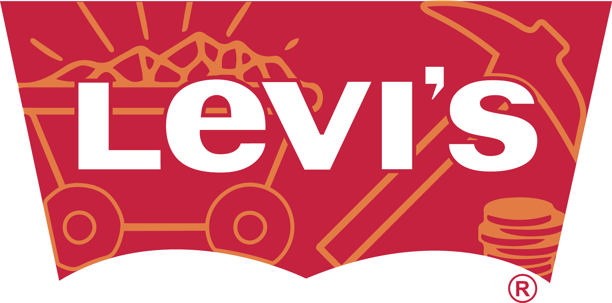
In 1853, Levi Strauss created his brand of jeans in the height of the California Gold Rush. This logo features a mine cart, a pickax, and some golden coins to reference this historical time. It captures the ruggedness and the history of the brand, while paysing a tribute to the people who wore Levi’s during this time. This logo remake captures Levi’s identity and where it all began.
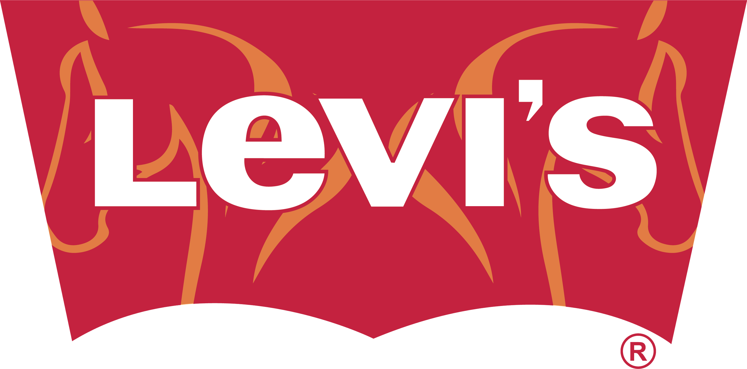
The most iconic version of the Levi’s logo was designed in 1892 and featured two horses pulling a pair of jeans in the opposite direction, alluding to the jeans durability. To honor this original logo, the redesign features two horses facing opposite ways. By adding these horses back into the logo, it becomes nostalgic and shows how long the brand has truly lasted.
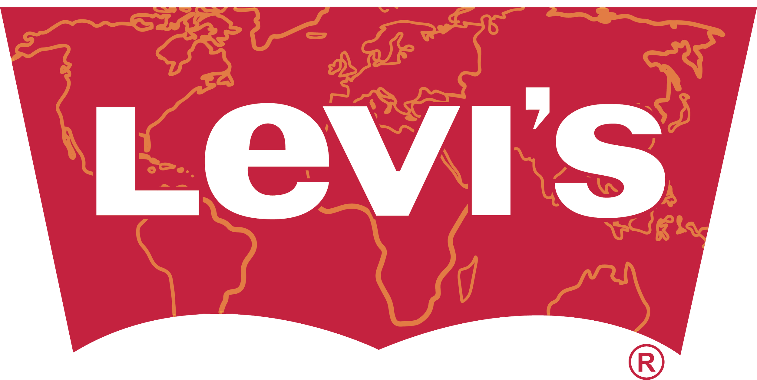
As Levi’s brand grew, it began expanding internationally. The world map outline symbolizes the growth of the brand and shows that their products are offered worldwide. It also supports their original mission for making jeans that can be worn by all different types of individuals. This map logo highlights the adaptability of the brand and its legacy.
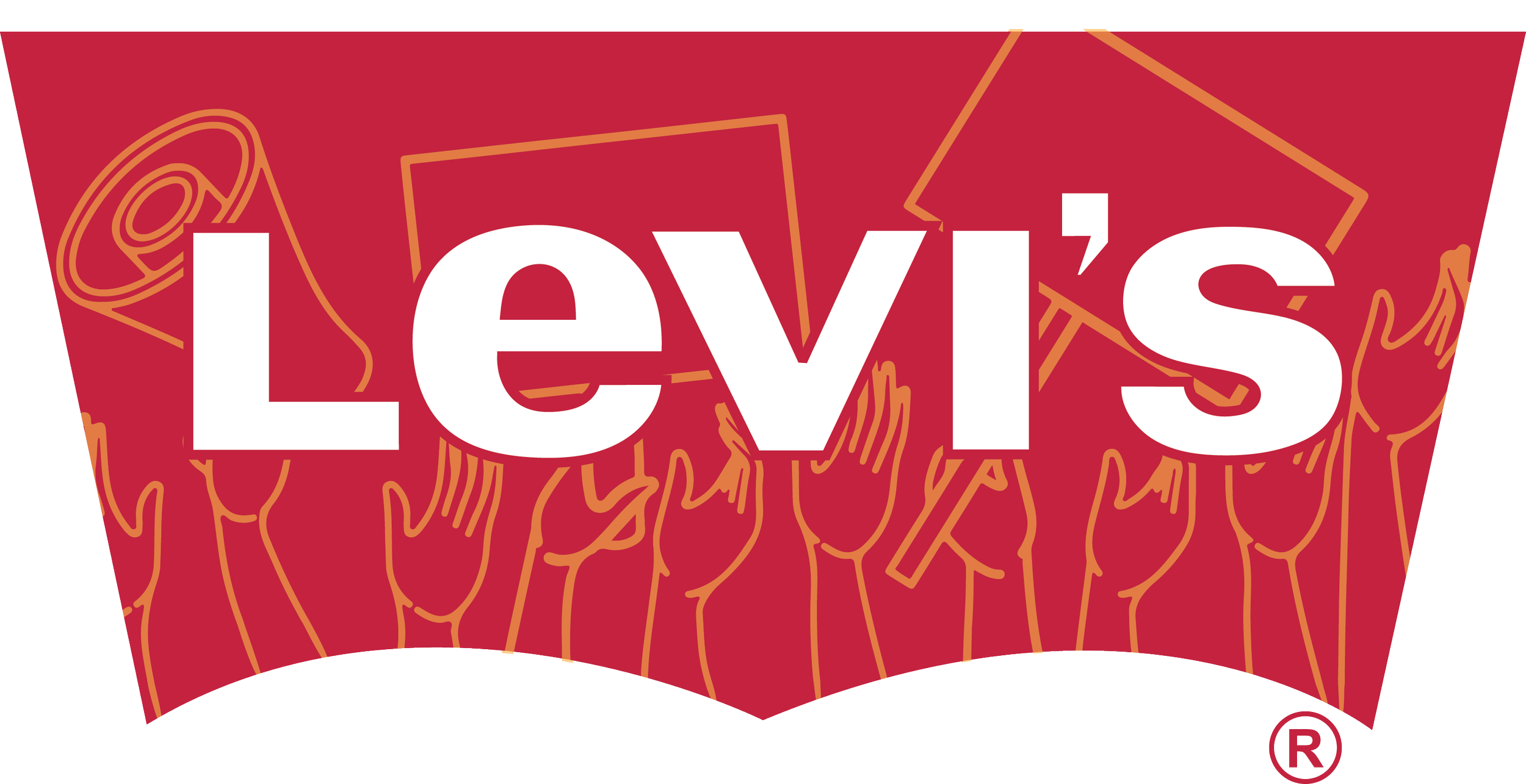
This logo remake features individuals protesting. The inspiration for this design came from Levi’s standing up for various cultural and political issues, starting in 2017. By featuring these design elements, the new logo shows that the brand is not just a fashion icon, but rather a brand that is willing to make their voice heard, encourage change, and support individuals of different cultural and political backgrounds.

In 2011, Levi’s wanted to reduce the amount of water being used for the production of their jeans. This prompted their Water < Less movement. By integrating a splash of water into this logo remake, it visually reflects Levi’s efforts to reducing their water consumption. The design brings attention to this movement and highlights the brands dedication to environmentally friendly practices and the impact it has made.
Design Process
To develop this rebrand, I conducted extensive research on the company's history and the evolution of its logo. I chose to retain the original color palette, as it is a defining element of the brand’s identity. Additionally, I integrated key historical elements into the new logo designs, ensuring they reflect the brand’s rich legacy while offering a fresh perspective.
Programs Used
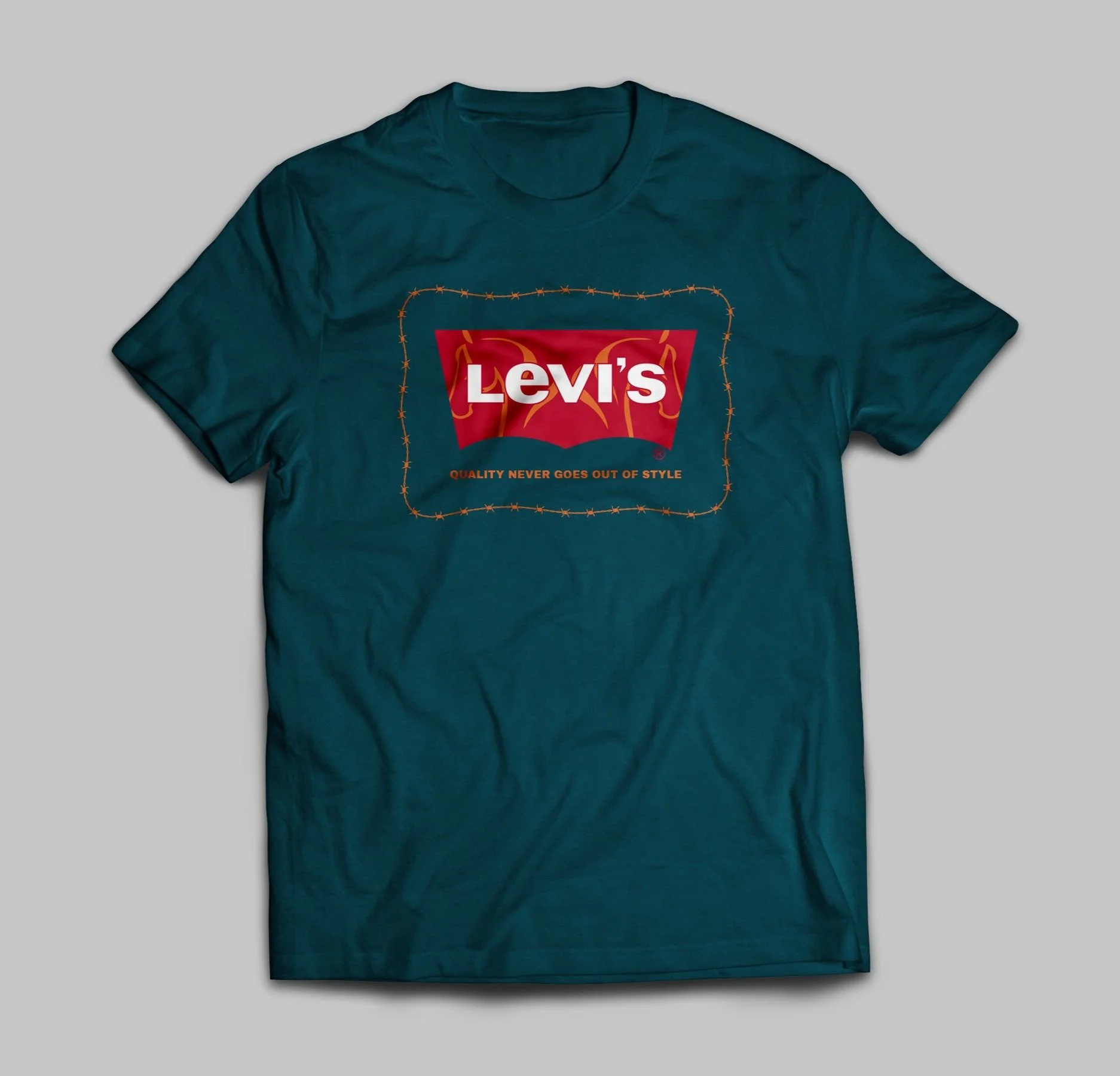
I used Adobe Photoshop and Adobe Illustrator to complete this rebrand.

Levi’s Brand Overview
Levi’s has only undergone 8 logo redesigns in over 150 years. Over the decades, there has only been one logo made that includes a graphic. Ironically, this imagery is still used on the brand tag of their jeans today. The brand featured a serif font in the original logo, but has steered away from that and has maintained a sans-serif font since. The brand has always had bold, bright colors that stand out.